28 August 2026
How to Design a Professional Product Label for Free
A professional-looking label does not require a graphic designer, an expensive software subscription, or any design experience. It requires understanding a few principles that separate labels that look homemade from ones that look like they belong in a shop.
This guide covers what makes a label look professional, the five elements every product label needs, and how to put it together for free.
What makes a label look professional
Professional labels share a few consistent characteristics:
Restraint. They do not try to include everything. The product name is the hero. Everything else supports it.
Clear hierarchy. Your eye knows immediately what to read first, second, and third. This is achieved through size, weight, and spacing — not colour or decoration.
Consistent spacing. Padding is even on all sides. Text does not bump against the edge of the label. White space (even on a coloured label) is treated as a design element, not wasted space.
Two fonts, maximum. One for headings, one for body text. Anything more looks cluttered. The two fonts should contrast — a serif paired with a sans-serif, for example — not compete.
If your label does all four of these things, it will look professional regardless of how simple the design is.
The 5 elements every product label needs
Depending on your product and market, legal requirements vary. But these five elements belong on almost every handmade product label:
- Product name — the most prominent element. This is what the customer remembers.
- Net weight or volume — required for most food and cosmetic products sold commercially. In the UK and EU, this must be on the label.
- Ingredients or contents — required for food products, cosmetics, and candles (for allergen declarations under CLP regulations).
- Brand or maker name — not always legally required for home-to-home sales, but important for building recognition.
- Contact or origin information — an email, website, or location. Required for many regulated products; builds trust for all of them.
For candles specifically, UK/EU CLP regulations require hazard pictograms and signal words if the fragrance contains regulated chemicals. Worth checking before you print your first batch.
Choosing fonts
Font choice does more brand-building than almost any other design decision. Here is how to think about it:
Serif fonts (Cormorant, Garamond, Playfair Display, Times) signal heritage, craftsmanship, and premium positioning. They work well for artisan candles, natural skincare, and specialty food. Use a serif for your product name when you want the label to feel established and quality-focused.
Sans-serif fonts (Work Sans, Montserrat, DM Sans, Helvetica) signal clarity, modernity, and approachability. They work well for minimal, contemporary, or functional products. Use a sans-serif when you want the label to feel clean and confident.
Script and handwritten fonts (Pacifico, Dancing Script, Satisfy) signal personality, hand-making, and warmth. They work well as accent fonts — for a tagline or maker name — but rarely work as the primary font at small sizes because legibility suffers.
The most reliable pairing: serif product name + sans-serif body text. It is a classic combination used across almost every premium food and lifestyle brand.
Colour: how to pick 2–3 that work
You do not need a colour theory degree. You need a palette of two or three colours that feel intentional together.
A simple approach: start with your background colour (cream, white, kraft brown, black), then pick one accent colour for the product name or a border element, and one neutral for body text.
Warm palettes (cream, terracotta, sage green) read as artisan, handmade, and natural. Cool palettes (white, slate, navy) read as modern, clinical, or premium. Match your palette to how you want your product to feel.
Avoid using more than three colours on a small label. It becomes visually noisy and harder to read.
Sizing: don't cram — white space is your friend
The single most common mistake on homemade product labels is trying to include too much text in too small a space. When everything competes for attention, nothing stands out.
Practical rules:
- Minimum font size for body text: 7pt for print (smaller is technically possible but hard to read)
- Product name: at least 2× the size of the body text
- Leave at least 3–4mm padding on all edges inside the label border
- If the text feels cramped, reduce the font size or remove an element — do not shrink the margins
A simpler label with breathing room always looks more professional than a packed one.
Tools: an honest comparison
Microsoft Word / Google Docs. Not built for label layouts. Margin and size control is limited. Getting a label to fit a specific Avery sheet size is fiddly and unreliable. Works in an emergency; frustrating for regular use.
Canva. More capable. Good font selection and design flexibility. The gap is in print setup: matching your canvas exactly to an Avery sheet, setting bleed, and ensuring the print output aligns with physical label positions requires manual configuration that many users get wrong. Also: the free plan has export limitations.
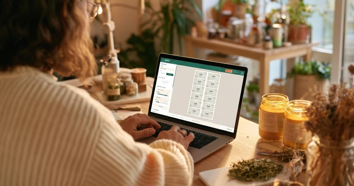
Labeliladi. Designed specifically for print-at-home product labels. You enter your label dimensions (or pick a common size), design your label, and it automatically tiles copies across a full A4 sheet with correct margins — ready to print on any Avery or compatible sticker sheet. Free to use.
The process is simpler than it looks. Pick two fonts, choose a restrained colour palette, leave breathing room, and include the five elements above. That is what professional labels do — done well, it is more than enough.
Ready to design your label?
Free to use. Works with any Avery sticker sheet and a regular printer.
Start designing for free